Serif vs. Sans Serif
There is little, if any, significant difference in legibility between serif and sans serif fonts but some designers feel that serifs are easier to read—serifs create a series of dashes and dots which help carry the reader’s eye across the line of text and, therefore, make the text more legible. On the other hand, serif text can lose this linear effect if it is read on a computer screen—the serif may actually create noise which will reduce legibility. There is no steadfast rule regarding serifs but, generally, serif fonts are a good choice for printed material and sans serif is best read on a computer screen. See the below image for a comparison:
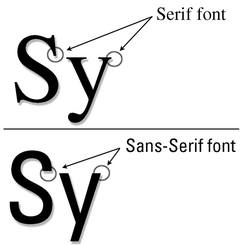
(Image taken from http://www.symplebyte.com/general_usage/fonts/serif_or_sans-serif.html)
For more information on fonts check out http://alexpoole.info/which-are-more-legible-serif-or-sans-serif-typefaces/
Gestalt Principles of Design
The Gestalt principles of design help us understand how readers see and interpret images.
Figure-Ground Contrast
Everything we see relies on our ability to distinguish one image from another and our ability to perceive the distance of an image in relation to another image. In this design principle “figure” refers to the image and “ground” refers to the background. A strong contrast between the figure and the ground results in increased visual clarity.
Take a look at the following images: what has the strongest figure-ground contrast? If you said the image on the right you are correct!

(Image taken from http://articles.katorlegaz.com/quicktipsinartanddesign/value/)
Degrading Figure-Ground with Visual Noise
Figure-ground contrast can be degraded by visual noise. Visual noise is anything that impedes our perceptual response to an image and can include:
- Using a difficult to read typeface
- Outlining, shading, or boldfacing text
- Inserting vertical and horizontal gridlines on a line graph
Grouping
Grouping creates visual cohesion by organizing images into units and subunits and is a useful tool for structuring documents through:
- Pieces of text
- Pictures
- Icons
- Lines
- Bullets
Grouping like information together enables readers to sort through documentation easily and efficiently.
For more information visit http://facweb.cs.depaul.edu/sgrais/gestalt_principles.htm
The Visual/Verbal Cognates
There are six design strategies that will help you maximize the rhetorical situation of your document. These six strategies fall into three design categories: visual structure and organization, style and readability, and voice and credibility.

Visual Structure and Organization
Arrangement
The arrangement of a document refers to the spatial organization of its elements
- Proper arrangement creates structure, helps reader’s access information, and provides visual balance and proportion.
- Documents are generally arranged sequentially and hierarchically.
- Websites are generally organized dynamically—users can access information randomly through toolbars, etc.
Emphasis
The emphasis of a document refers to its ability to draw a reader’s attention to specific elements in the document.
- Bolding and italicizing text.
- Borders and callouts for images.
- Shading and highlighting tables and charts.
Style and Readability
Clarity
The clarity of a document refers to how successful the visual language is in helping the reader understand the message. To increase clarity:
- reduce visual noise (orange text on a yellow background is bad!)
- understand the readers
Conciseness
Document conciseness refers to the visual intricacy of a document. To ensure that the document is not over-designed, take note of the:
- number of headings, lists, colours, images, etc.
- detail included in charts, tables, images, etc.
- spacing between the text
Voice and Credibility
Tone
The tone of the document refers to how the visual language depicts a specific feeling to the audience:
- casual vs. serious
- informal vs. formal
Ethos
The ethos of the document refers to the credibility that it achieves through visual language. Ensuring that the document is appropriate for its intended audience instills trust in its readers.
- Professional tone and design for a professional audience
For more information on visual rhetoric check out http://en.wikipedia.org/wiki/Visual_rhetoric
The Rhetorical Situation
During the planning stages of document design it is important to define the rhetorical situation of the project. The rhetorical situation comprises three elements—audience, purpose, and context. Together, these three elements will provide you with a list of requirements that need to be considered when designing a functional document for your intended reader.

Audience
The audience defines those who are going to use the document:
- who they are
- what they know about the subject
- their previous experience with communications like the one you are creating
- their demographics (age, culture, education level, etc.)
Information about the audience will give you direction on what information needs to be included in the document, the tone in which to present the material (fun, professional, etc.), and the level at which the material needs to be presented (basic, intermediate, or advanced).
Purpose
The purpose defines what you want your document to accomplish:
- persuade readers to think or act
- enable them to complete a task
- help them understand a function or application
- change their attitude towards a thought or product
Information on the purpose of the document will give you direction on how to present the information in an accessible way for your audience, such as, numbered lists for task oriented documents.
Context
The context defines the physical and temporal circumstances in which the reader will use your document:
- at their desk
- in a busy factory
- during a slow period
- during a company crisis
Information on the context will give you direction on the deliverable (PDF if read at a desk, hardcopy if read while in a busy factory, etc.) and how to present the information (large headings if the reader will be interrupted frequently.).
For more information on the rhetorical situation check out: https://owl.english.purdue.edu/owl/resource/625/01/
